How to style using Tailwind CSS in React

React is a popular frontend UI library that is used in almost 50 million projects each month. React is supported by Facebook, has a number of notable companies, ranging from startups to Fortune 500 companies, and has dominated the web development market for more than nine years.

Due to React JS’s phenomenal growth, a variety of libraries, tools, and add-ons for styling, state management, page routing, etc. have successfully handled the limitations of the framework. As a React developer, styling your React application is typically what you’ll be doing most of the time. 

Many great libraries have been developed since the advent of CSS libraries and frameworks to make it easier for developers to create user-friendly interfaces. Though many of them (such as Bootstrap, Bulma, and Foundation) comes with predefined components, negating the need for dynamic customization, they impose design decisions that are challenging to reverse. The developer has less control over the style of the component when using prebuilt components. This is one of the reasons why Tailwind CSS is an ideal choice for front-end developers who want to have full control of the UI.

In this detailed blog, we will cover all the fundamentals that you need to know to get started with Tailwind CSS in React.

So, let’s get started!

What is Tailwind CSS?

Tailwind CSS is an open-source utility-first CSS framework that makes it easy to apply excellent styling to your React web application by choosing from the framework’s ready-made CSS classes. Tailwind CSS  gives you the creative control to create dynamic components – which means you can tweak the values of properties to make highly customizable UI components.

Tailwind CSS follows a mobile-first approach that enables developers to create web applications that are responsive. According to Npmjs, nearly 11 million projects use Tailwind CSS each month. With over 200 contributors, it is one of the most active open-source projects. One major benefit of using Tailwind CSS is that it results in a small CSS bundle by eliminating all unnecessary CSS and speeds up website loading.

Why Use Tailwind CSS?

The field of web development is vast, and new tools are constantly being developed. Developers can avoid a number of common issues by using Tailwind CSS. Simply by using the predefined class names, Tailwind assists in creating a UI that looks good.

 The following are some advantages of Tailwind:

No naming convention: Having to name classes is one of the most difficult aspects of writing custom CSS. By offering utility-based classes, Tailwind CSS seamlessly resolves those issues.

Highly customizable: Tailwind CSS doesn’t provide you with a class name that represents the entire component; instead, it provides you with a class name that represents a specific style, such as height, width, margin, etc. These utility classes can be used to create a component from scratch.

Mobile-first strategy: The Tailwind CSS framework employs a mobile-first strategy by default. It is simpler to build complex responsive layouts freely thanks to the availability of all kinds of utility classes. Utility classes can be used conditionally across a range of breakpoints like sm, md, lg, etc., which aids in creating intricate responsive layouts.

Caching: Tailwind CSS uses the same class names repeatedly, so you won’t have to load the same styles repeatedly! This shortens the time it takes for a page to load during the development phase. 

Since Tailwind CSS is a standalone framework, it can be used with virtually every current framework, including React, Angular, Gatsby, Laravel, and others.

Here, TailwindCSS will be explained using React.

Getting Started: Creating a React application

First thing first, you must have NodeJS installed on your PC in order to create a React application. You can download it from nodejs.dev

Run the following code in the terminal to confirm that NodeJS is installed.

If the version number is printed, NodeJS has been successfully installed on your system, and the code to create a React app can now be executed. To create the React application, we’ll use the build tool create-react-app. 

Run npx create-react-app on your terminal, and it will take care of the rest for you. After installation, you’ll see something like this:

This is a good start, and you can now navigate to the project folder using the command cd project_folder_name. After that, running npm start will by default display the website at http://localhost:3000.

We are now all ready to use the React application. Let’s set up Tailwind CSS in our project now. 

How to configure Tailwind CSS in React

Installing Tailwind CSS as a dependency and configuring the template path are all that are required to configure Tailwind CSS. We’ll proceed in the same manner and learn how to complete it on our own.

By running the following command, we can first add the Tailwind CSS as a dependency to our React project.

JavaScript plugins are used by PostCSS to make CSS compatible with the majority of browsers. With the help of these plugins, you can lint your CSS, support variables and mixins, transpile upcoming CSS syntax, inline images, and more.

Installing Autoprefixer and Tailwind CSS together is a requirement. It is a PostCSS plugin that uses caniuse.com values to add vendor prefixes to CSS rules automatically.

We can initialize Tailwind CSS by running the command tailwind init and it will create a default configuration file for Tailwind. After running the command, you will see a default tailwind.config.js like this:

The tailwind.config.js file needs to be updated to include all of the paths to your template files. Since we are dealing with React here, you call the files with extensions like .js, .jsx, .ts, or .tsx.

After adding the paths, you can now add the Tailwind directives to your CSS file. Add the following Tailwind layers to your CSS file, index.css in this case.

@tailwind base: It will inject Tailwind’s base styles, which combine Normalize.css and a few other base styles.

@tailwind components: This injects any component classes registered by plugins based on our config file (reusable styles like cards, buttons, form elements, etc.).

@tailwind utilities: This injects all of Tailwind’s utility classes (both the default and your customized utilities) which are generated based on our configuration file.

Now you can start your development server by running npm run start.  By styling a simple text, you can determine whether Tailwind is installed properly or not. 

                                     filename:- index.js

The output will be like this:

With just a few lines of code, we can create a small text component. You are now prepared to use Tailwind CSS in a practical setting. 

Getting Started with Tailwind CSS

There are a number of pre-built classes in Tailwind CSS that we refer to as utility classes, and we can use their class names to apply the style to the appropriate element. The majority of the class names we required for our project are present, and we can also change the default configuration to include additional styles. 

We will cover all the basics you need before starting a new project with Tailwind CSS:

Height & Width

Tailwind has several utility classes for adjusting the height and width of the element. Pixel values, percentage values and relative values are all part of it. 

We can look at a small example to visualize it.

The output will be different boxes with various heights and widths.

Padding and Margin

Tailwind has utility classes for setting margins and padding around the content that is similar to classes for height and width. You can use the values appropriately because they are almost identical to height and weight in terms of their properties, like mx-1 for margin-left: 0.25rem and margin-right: 0.25rem.

On the TailwindCSS official documentation, you can view every value that is offered.

Let’s look at a brief example where margin and padding are used.

Filename:- index.js

The output will be as follow:

CSS Flexbox and Grid

Almost all flexbox and grid properties can be defined using one of the many utility classes provided by Tailwind. Flex basics, flex-direction, flex-wrap, grid columns, grid rows, justify properties, align properties, and all other related classes are all available in Tailwind.

A simple example of CSS flexbox implementation using Tailwind CSS is shown below.

Filename:- index.js

The output will be like this:

Almost all of the design requirements are met by Tailwind’s utility classes. The framework includes utility classes for CSS properties like margin, padding, layout, sizing, typography, backgrounds, borders, filters, effects, and animations.

Responsiveness in Tailwind CSS

With Tailwind, you can create responsive designs using utility classes, just like you would for the rest of your design. There are screen-size-specific versions of each utility in Tailwind.  Tailwind by default adopts a “mobile first” strategy in which each screen size corresponds to a minimum viewport width. 

By default, five breakpoints were designed after typical device resolutions:

sm: For devices with a width of greater than 640 pixels. It represents a normal mobile phone.

md: for devices with a width greater than  768px. It represents medium size devices.

lg:  for devices with a width greater than 1024px. Usually for tablets and small laptops.

xl:  for devices with a width greater than  1280px. These are mainly for desktop monitors.

2xl: for devices whose width is above 1536px. Usually for large screen external monitors.

Although it seems straightforward, this method is actually very effective and can be used to create complex, attractive, and responsive designs.

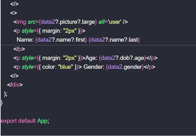
Creating a User Card with Tailwind CSS

Now, let’s use Tailwind CSS to create and style a user card.

Filename:- index.js

When we create a responsive user card with Tailwind CSS, the desktop view looks like this:

It looks clean and tidy. Now let’s take a look at the mobile view.

Here, you can see how we were able to create an aesthetically pleasing interface using just a few lines of code, all thanks to Tailwind. You can clearly see that this method produces understandable code as compared to plain CSS.

Adding Custom Styles to TailwindCSS

Figuring out what to do when a framework isn’t able to provide for all of your needs can be difficult when using one, which is oftentimes the biggest challenge. Tailwind was created with extensibility and customization in mind, so no matter what you’re building, you’ll never feel like you’re at odds with the framework.

Add your customizations to the theme section of your tailwind.config.js file if you want to change things like your color scheme, spacing scale, typography scale, or breakpoints:

filename: tailwind.config.js

You can add custom new styles to the config file like this. Tailwind CSS offers a default theme with a very generous set of values to get you started, but don’t be hesitant to modify it or expand upon it; you’re encouraged to customize it as much as you need to meet the needs of your design. 

You can also add arbitrary values something like top-[125px], m-[19px]. This applies to everything in the framework, including pseudo-element content, background colors, font sizes, and more. You can also use square bracket notation to create totally arbitrary CSS if you ever need to use a CSS property for which Tailwind doesn’t already include a utility.

You might have realized by now, after reading this article, why Tailwind is one of the best CSS frameworks. Styling your web application is simple with TailwindCSS. 

You can always go to online communities and ask for help if you ever find yourself stuck with a problem. The Tailwind CSS team also provides prompt solutions to ensure that problems are resolved quickly. 

Tailwind CSS has created quite a stir in the technologically advanced world, but there are many other reasons too that make Tailwind the preferred choice for developers.

Wrapping It Up!

Congratulations on reaching this far! You’re a fantastic reader!!

In this detailed blog on Tailwind CSS in React, we looked at how we can make our application look beautiful and clean with Tailwind CSS. We’ve spoken about installation, customizing, and identifying the best practices with Tailwind CSS. This blog is a good start if you want to start using Tailwind in your next project.

Now you know how to style your React application with Tailwind CSS in the most effective and efficient way.

Happy Styling!


Getting started with web accessibility in ReactJS

React is a widely preferred frontend UI library, used in nearly 50 million projects every month. React, which is supported by Facebook, has dominated the web development market for more than nine years and boasts a number of notable clients (startups to Fortune 500 companies).

Source

Web accessibility is one of the most significant, but least considered, topics by web developers. It is simple to forget accessibility when creating new fancy web applications with React or even to forget the native features that React offers to make the website more accessible. This comes with a price to pay.

In this detailed tutorial on accessibility tools in React, we will walk you through the various methodologies through which you can make your React application accessible to everyone.

So, let’s get started!

What is Web Accessibility

Web accessibility is the practice of designing and building websites and digital tools so that people with different abilities can use them without difficulty.

A new set of accessibility features and problems have emerged as web applications become more complex and dynamic. Numerous semantic elements, such as “main” and “section,” have been added to HTML. Instead of focusing only on presentation, semantic HTML gives the web page important meaning. This makes it easier for web browsers, search engines, screen readers, RSS readers, and ultimately users, to comprehend.

A website that is accessible eliminates obstacles and guarantees that users with and without disabilities have equal access to the website’s functionality. Web accessibility also affects people with temporary disabilities, such as someone who has broken an arm, or situational limitations – such as when a person is unable to hear the audio due to loud background noise. Accessibility support is required for assistive technology to interpret web pages.

How to Make a React Application Accessible

ReactJS fully supports the creation of accessible websites, which usually make use of conventional HTML methods. You can ensure that your web application is as quickly and easily accessible as possible by following a few simple steps:

Using HTML Semantics:  

The distinguishing characteristic of a semantic element is that it makes its meaning clear to both the developer and the browser. These elements clearly define its content. 

Use semantic HTML whenever possible to make your website accessible to screen readers and to make your code more understandable. Semantic HTML tags can be used by search engines and other user devices to assess the significance and context of web pages.

Following the basic Structure

Design the interface with everything interconnected so that the user has a path to follow. In addition to structuring, headings, sections, navbars, etc. must be placed in proper locations. These semantic components serve as logical sections and improve the website’s structure.

    source

Regardless of size or complexity, an accessible semantic structure will enable accessibility on any website. Your website’s accessibility will be worse as it grows if it lacks a strong semantic foundation. Setting the right structure early in the development process helps your website stay navigable as it expands.

Keyboard Focus

When implementing accessible websites, keyboard focus is an important point to keep in mind. If you don’t make sure that keyboard focus is properly managed, users who can’t use other input methods will find it difficult to interact with your website. It is a good idea to create an outline around the input section to let the user know which input element is currently selected.

This implementation is noticeable on the Google Home page.

This can be implemented by using useRef in React so that we can access the input element and focus on it when the user clicks or hovers through the input section. The code for this is illustrated below:

Issues with keyboard accessibility on websites occur when designers or developers use techniques that go against standard keyboard functionality.

Accessible Rich Internet Applications (ARIA)

Web content and web applications can be made more accessible for people with disabilities by implementing a set of attributes called Accessible Rich Internet Applications. ARIA defines semantics for many popular UI controls so that screen readers and other assistive technologies can understand what our DOM nodes stand for.

Let’s understand ARIA with a small example.

You can see that we have provided the aria-label attribute and the screen readers know that it is a button because we used a button tag and the aria-label tells us that this button is to increment something. 

Using React Fragments

Fragments are a common pattern in React for a component to return multiple elements. Fragments let you group a list of children without adding extra nodes to the DOM. In some cases, using <div> elements in React may violate HTML semantics, resulting in difficult-to-understand page structures or invalid HTML.

Let’s look at an example where we need to use fragments:

We know that in React, we should only have one parent JSX element. If we try to wrap the list items in the above example in a <div> ,it will result in having an invalid list. In this situation, it is ideal to use fragments.

Fragments hold HTML valid and understandable, especially for users who may rely on screen reader technologies or other users who may not have access to the page’s visual elements.

Labeling

In order to make the forms accessible, labeling is used. Every HTML form control must have an accessible label. A textual label should be provided for each control.

Screen readers can better understand the context of the control they are interacting with when a label is provided. To indicate where it labels in HTML, we use the for attribute; in React, we use the htmlFor attribute. 

We have seen several ways in which we can increase web accessibility. There are some countries that have some regulations that require the website to be accessible to everyone.

Let’s now look at some of the tools that can help us identify accessibility issues in your React application.

Accessibility Tools for React Applications

Thanks to the size and constant growth of the React ecosystem, there are many tools available that can assist developers in creating web applications that are more accessible. 

Although you can detect some common accessibility issues using these tools, they won’t complete your task for you. It is your duty as a developer to make a concerted effort to create more inclusive and accessible digital products from the very beginning of the project.

eslint-plugin-jsx-a11y

To identify accessibility problems in React applications, this plugin performs a static evaluation of the JSX. Use it in combination with @axe-core/react to test the accessibility of the rendered DOM since it only detects errors in static code. Always test your apps using assistive technology, treating these tools as just one step in a larger a11y testing process.

You can make sure you are strictly adhering to some accessibility standards right away with real-time understanding if you are using an editor linting plugin. This plugin has 33 testable rules enabled, including label-has-for and alt-text.

When you use create-react-app to create a React project, it already has this tool configured, but it only has a portion of the configurable accessibility rules enabled by default. You can enable more rules by creating a .eslintrc file.

axe-core-react

The axe-core-react can be used in a React project in development to highlight accessibility issues whenever a component updates in the Chrome DevTools console.

You can run the axe-core-react plugin with the default configuration or you can add additional options.The following code shows how to run axe-core-react in your application.

react-aria-modal

It is a fully accessible and flexible React modal built according to WAI-ARIA Authoring Practices.

The React team advises using this modal library because it complies with web accessibility guidelines. It controls keyboard focus, key mapping, and ARIA roles to make sure that screen readers can access your modal.

Your component will be wrapped in a modal component that makes it simple to use, customizable, and enforces accessibility standards. This tool is extremely helpful because modals are some of the least accessible features of websites.

The axe accessibility linter VS Code extension

You can use the axe accessibility linter extension for Visual Studio Code to check React, HTML, Vue, and Markdown for some common accessibility flaws. It identifies the accessibility issues in Javascript, JSX, typescript, Vue, HTML, and markdown files.

The advantage of this extension is that it doesn’t require configuration. After installation from the VS Code Marketplace, it immediately begins linting compatible files for accessibility faults without requiring any further configuration. Installation can occasionally require a few minutes. Axe accessibility linter will start operating on compatible source files after this step is finished.

Web AIM Color Contrast Checker

According to the Web Content Accessibility Guidelines, the normal text should have a color contrast ratio of 4.5:1 for Level AA. The normal text must have a contrast ratio of 7:1 to reach Level AAA.

The two colors you’ve chosen will be analyzed by this tool, which will also provide the color contrast ratio. When creating a color scheme, you can check to see if it will go against any accessibility standards.

Google LightHouse

You can perform an accessibility audit of your website using Google’s Lighthouse Chrome DevTools. It produces a report that you can use to improve your website’s flaws.

The Google Lighthouse, like the majority of accessibility tools, evaluates web content in reference to the Web Content Accessibility Guidelines (WCAG). WCAG, which is published by the World Wide Web Consortium (W3C), is the accepted digital accessibility standard.

WAVE Evaluation Tool browser extension

You can use this additional Chrome browser extension to find accessibility problems with your website. Before using this extension to audit your web application for accessibility flaws, you must host the app. 

By adding icons and indicators to your page, it gives users a visual indication of how accessible your web content is. WAVE facilitates human evaluation and informs users about accessibility issues, but no automated tool can tell you whether your page is accessible. The browser handles all analysis, enabling secure evaluation of local, password-protected, intranet, and other sensitive web pages.

Axe DevTools browser extension

The free Axe DevTools browser extension is a fast, lightweight, yet powerful testing tool driven by the world’s most trusted accessibility testing engine, axe-core, developed by Deque.

The need for manual testing is drastically reduced when accessibility issues are proactively found and fixed using axe DevTools, giving you quick wins without slowing down development. The extension is available for Google Chrome, Mozilla Firefox, and Microsoft Edge. 

Conclusion

Congratulations on reaching this far! We are glad you read the article.

In this detailed blog on accessibility for React applications, we have covered various ways to make websites accessible. We have also discussed various best practices and accessibility tips and tricks.

Now you know how to make your React application accessible.

Happy Reacting!


React useEffect v/s useLayoutEffect Hook: Key differences

React is a popular frontend UI library that is used in almost 50 million projects each month. React, which is supported by Facebook, has a long history of dominance in the web development industry and a long list of notable clients, including Fortune 500 firms and both startups and established businesses.

React utterly depends on components, which are the basic building blocks of React applications. There are two approaches to writing a React component in the world of React. The first employs a functional approach, whereas the second employs a class-based approach. These days, functional components are quite popular, and the introduction of hooks has encouraged more people to adopt creating function-based components.

Some of the most useful hooks available are useState, useEffect, useRef, useLayoutEffect, useMemo, etc. In this in-depth article, we will cover the difference between the useEffect and useLayoutEffect hooks. 

What is the useEffect hook in React?

Eliminating the side effects of using class-based components is the driving force behind the development of useEffect Hook. One thing to keep in mind is that useEffect only runs after React renders your component, so your effect callback will not prevent browser painting. This is different from how class components behave, where componentDidUpdate and componentDidMount run synchronously following the rendering. This approach is more efficient, which is generally what you want most of the time.

For instance, actions like updating the DOM, obtaining data from API endpoints, configuring timers or subscriptions, etc., may have unintended side effects.

The following situations in functional components allow for the use of the useEffect hook to carry out operations (or side effects):

  • when a component is rendered (componentDidMount function in class-based components).
  • when a component undergoes an update (componentDidUpdate function in class-based components).
  • before a component is unmounted or removed (componentWillUnmount function in class-based components).

Most frequently, we use useEffect hooks to carry out actions such as obtaining data from an API, altering the DOM, or performing a specific method when the useEffect’s dependency changes.

How to write useEffect hooks in React

Every time the useEffect hook is activated, it returns a callback function that will execute the declared function. The dependency array decides when the useEffect should be triggered. If we have an empty dependency array, the useEffect will only work once when the component renders. If we have single or multiple dependencies, useEffect will be triggered whenever the dependencies undergo a change.

Let’s examine a straightforward example of useEffect in action.

 The output will be the following:

You can see that when the component renders, the useEffect hooks are only executed once. However, if there is another change in the DOM, it will cause the useEffect to be triggered for the second time. To avoid this, pass an empty dependency array. 

Now that we have a good idea about how the effect works, let’s discuss the useLayoutEffect hook in React.

What is useLayoutEffect hook in React?

React’s useLayoutEffect hook is almost identical to the useEffect hook. A function called effect and an array of dependencies are the first and second arguments, respectively, for the useLayoutEffect hook. 

After all DOM mutations have been completed by React, useLayoutEffect executes synchronously. If you need to measure the DOM (for example, to determine the scroll position or other styles for an element) and then modify the DOM or cause a synchronous re-render by changing the state, this can be helpful.

The useLayoutEffect hook’s syntax is almost identical to that of the useEffect hook. The effect, the first argument, has two possible outcomes: cleanup function or undefined. The code below demonstrates the useLayoutEffect function.

As you can see from the function above, useEffect and useLayoutEffect both accept an array of dependencies and an effect function as arguments, and they return either undefined or a cleanup function.

Let’s examine a sample of how to use the useLayoutEffect hook. 

The output of the following will be:

It is noticeable that useLayoutEffect functions in a manner identical to that of the useEffect hook. So what is the actual difference between these two hooks?

What is the difference between useLayoutEffect and useEffect hook?

The main difference between the useEffect hook and the useLayoutEffect hook is that the useEffect hook serves asynchronously, whereas the useLayoutEffect hook works synchronously. In simple words, we can say that the difference between useEffect and useLayoutEffect is in the time at which these functions are invoked.

It is useful to be aware of the steps that component re-render takes in order to comprehend when the hooks are called. Assuming that the useEffect hook is active in our app, we can get this series of events to happen.

  1. The user engages with the React app. Let’s just say the user clicks a button on the UI.
  2. The state of the components changes.
  3. The DOM is then mutated.
  4. Changes are then reflected on the browser screen.
  5. The function is invoked to clean up effects from the previous render if useEffect dependencies have changed.
  6. Following cleanup, the useEffect hook is invoked.

For the useLayoutEffect hook, the series of events will be

  1. The user interacts with the app. Let’s just say the user clicks a button on the UI.
  2. The state of the components changes.
  3. The DOM is then mutated.
  4. The function is invoked to clean up effects from the previous render if useLayoutEffect dependencies have changed.
  5. Following cleanup, the useLayoutEffect hook is invoked.
  6. The browser screen updates to reflect changes.

Your effect will typically involve synchronizing some state or props with something that doesn’t need to happen instantly or that doesn’t visually change the page. We might only need to retrieve data from an API, set an event handler, or take action when the state changes. The useEffect hook is employed to accomplish these kinds of tasks.

When to use useLayoutEffect hook in React

The useLayoutEffect hook should be used when your component flickers when the state is updated, which means that it first renders in a partially-ready state before re-rendering in its final state right away.

Now let’s compare useLayoutEffect and useEffect using an example:


We developed a simple app with a button element. When the user clicks the button, the value is updated to 0 and the dependency array of the useLayoutEffect array is value. Within the useLayoutEffect, we check the value and if it is 0, it changes the value from 0 to a random number.

In this example, the component is rendered twice, but the value is only updated once in the browser. Let’s look at the same example with useLayoutEffect.


You can see there is flickering when using useEffect since the component is rendered twice and the value is also updated twice.

Even though the component renders twice, the version with useLayoutEffect only updates visually once. On the other hand, the useEffect version renders twice, resulting in a blip where the value is briefly 0.

The main difference between the useEffect and useLayoutEffect hooks, as shown in the example, is the time at which they are fired. We will look into some real-world applications of these two hooks with some examples.

Let’s create an app that fetches data from a dummy backend API.


The output of the following code will be:

If you run this example on your machine, you will see that data is populated first in useLayoutEffect and then in useEffect. This is just because of the synchronous nature of the useLayoutEffect hook and the asynchronous nature of the useEffect hook.

UseLayoutEffect is preferred over useEffect hooks in the following situations:

Unforeseen visual or state changes

When dealing with inconsistent visual changes, the useLayoutEffect truly shines. When you use useEffect, you’ll notice a flicker before the DOM changes are painted, which is caused by how refs are passed on to custom hooks. These refs are initially null before being set when the attached DOM node is rendered.

When the effect does not require heavy computations 

Both useEffect and useLayoutEffect behave differently in terms of how heavy computations are handled. As previously stated, useEffect will postpone the execution of the effect function until after the DOM mutations have been painted, making it the obvious choice of the two. 

When we do heavy computation inside useLayoutEffect, we will block the DOM to re-render for some time. 99% of the time, we don’t need to block DOM updates. At this point in time, we only need to use useEffect and not useLayoutEffect.

Which is preferred, useEffect or useLayoutEffect?

The majority of the time, useEffect is the best option. If your code is causing flickering, try using useLayoutEffect instead and see if that tends to help.

Because useLayoutEffect is synchronous, the application will not update visually until your effect has finished running. If you have slow code in your effect, it may cause performance issues such as stuttering. Because most effects do not require breaking the default flow while they run, regular useEffect is always the best option in almost all cases, except a few.

Conclusion 

Congratulations on reaching this far! You’re a fantastic reader!!

In this detailed blog on useEffect v/s useLayoutEffect, we have seen various similarities as well as the uniqueness of useEffect and useLayoutEffect hooks. Not only did we understand the theory, but we also got our hands dirty by going through several real-world examples.

Now you know when to use useEffect and useLayoutEffect efficiently.

Happy Reacting!